Saturday, June 21, 2008

12. Scaffolds


Washington D.C. 6/16/08

"Scaffold" or "scaffolding" is one of my favorite words. It's ripe for metaphor, given it's positive connotations (supportive structure) and negative (criminal executions).

Scaffolds are useful and generally entirely utilitarian in design. Yet they can be beautiful in form even if the execution is crude. Repetition and symmetry are classical features of beauty in nature.

The relationship between a scaffold and a building is unbalanced but, again, symmetrical: the scaffold exists only to serve the needs of the more permanent structure, but is also necessary for the care and improvement of the building. The scaffold also obscures the design of the building, for which the scaffold may be resented and wished away.

To be a scaffold is to be required but unwanted, to serve only to be discarded. But a scaffold possesses one great and desirable trait: a purpose to which it is perfectly suited. We should all be so lucky.

Friday, June 20, 2008

11. In Flagrante


Washington D.C. 6/13/08

Yes, still milking the great light at Saint-Ex. This is a chocolate cake, and yet it didn't taste like chocolate at all. Don't get me wrong -- it was delicious. It's just weird to eat something that looks like chocolate, and is described as chocolate, but tastes like a mild spice cake.

Thursday, June 19, 2008

10. Ballerina


Washington D.C. 6/16/08

Sometimes when I'm walking around town, taking pictures of flowers and statues and stuff, I think "Wow, I must look like a jackass. Or a college student with a photo assignment." I like the idea that I might still be able to pass as some jackass college student.

Wednesday, June 18, 2008

9. Tree Levels


Washington D.C. 6/16/08

My blog post titles are getting a little prosaic, aren't they?

Tuesday, June 17, 2008

8. Lion's Ruff


Washington D.C. 6/16/08

A baby lion fashions a mane from foliage.

Monday, June 16, 2008

7. Matches


Washington, D.C. 6/16/08

Men play chess in Dupont Circle. I like their inward focus, the symmetry in their posture, and the gentle focus on the game.

Sunday, June 15, 2008

6. Cafe Collage


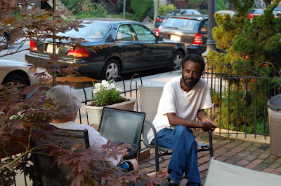
Washington D.C. 5:30 pm, 6/13/08

Another natural in front of the camera. His posture and clothes are so relaxed, and his gaze is so direct. The woman in front of him is working on a computer, but the scene makes it look as though she's sketching his portrait. I didn't ask him to pose -- I just shot this photo as I exited the restaurant next door (the title of the photo is the name of the cafe he's sitting outside). But he looks like he was waiting for me to photograph him anyway, doesn't he?

Again, the composition is weak -- I think I need less space above the subject. The car behind him dominates the field, and it's so boring! But this man is really riveting, so he saves it in spite of my mistakes.

The farther I am from the subject, the harder it is for me to make all the pieces work together. I prefer to photograph small objects up close. It's a great way to notice details I wouldn't otherwise. But it's also a bit of a cop out -- that's not really how I see the world, which is a lot more complicated than a label on a bottle or an ornament on a car.